Search
FITNESS ZONE
Brand identity, Conducting customer and market research., Typography
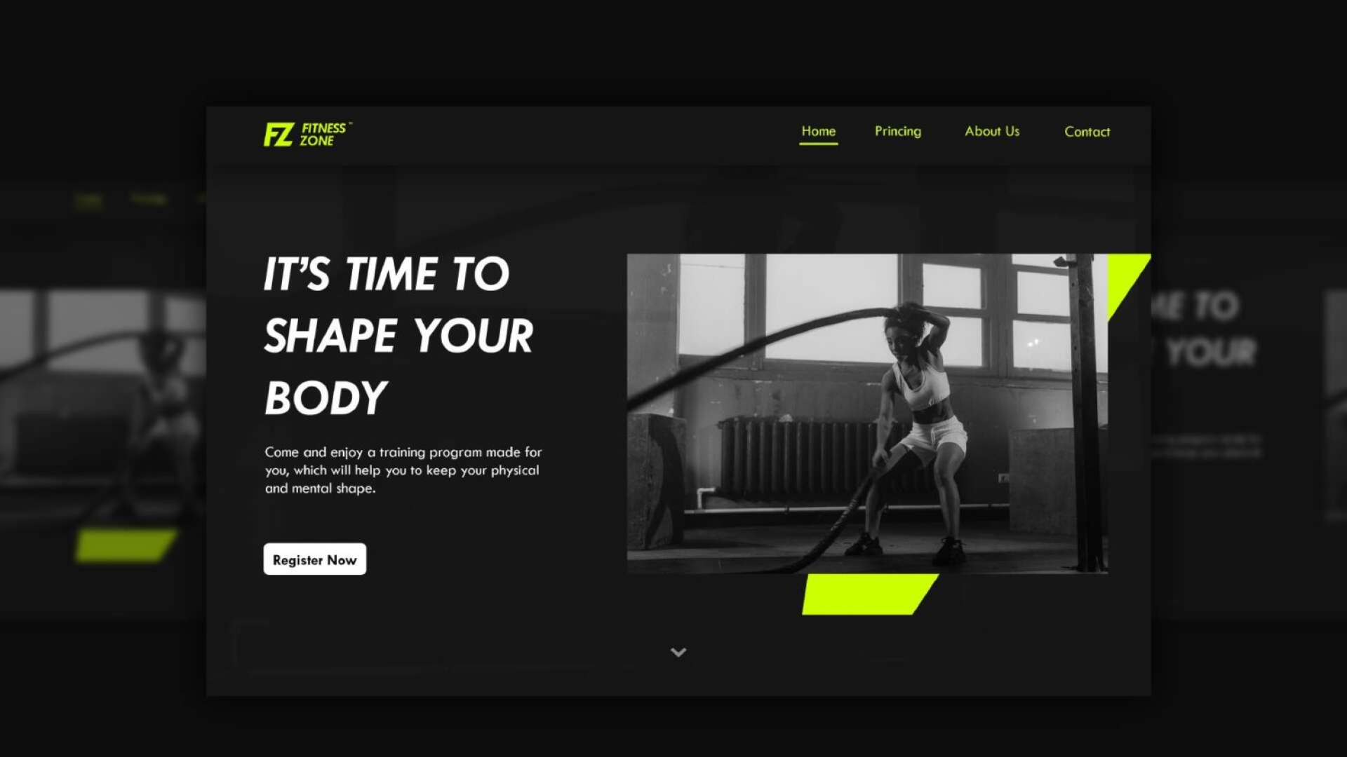
FITNESS ZONE is a Fitness Center that trusted ALM to come up with a modern and dynamic brand guideline that reflected their employees' professionalism and modernism.
Design of a brand guideline that reflects the professionalism and modernism of the employees of a Fitness Center.
Learn more about the Project: A Modern and Dynamic Fitness Center Brand Guideline That Speaks To The Era | ALM Creative Studio
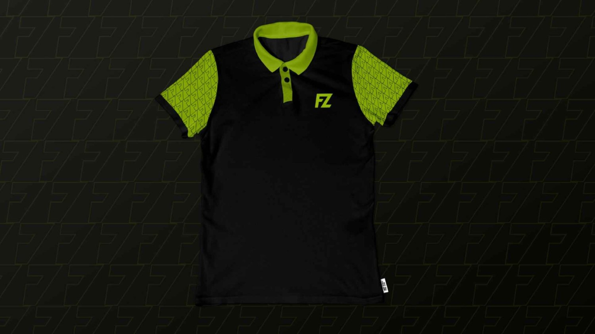
"We decided to use Black, white and Electric Lime to design the brand guideline because they were the best options for creating a clean and crisp appearance that would still be able to convey their message across all mediums."
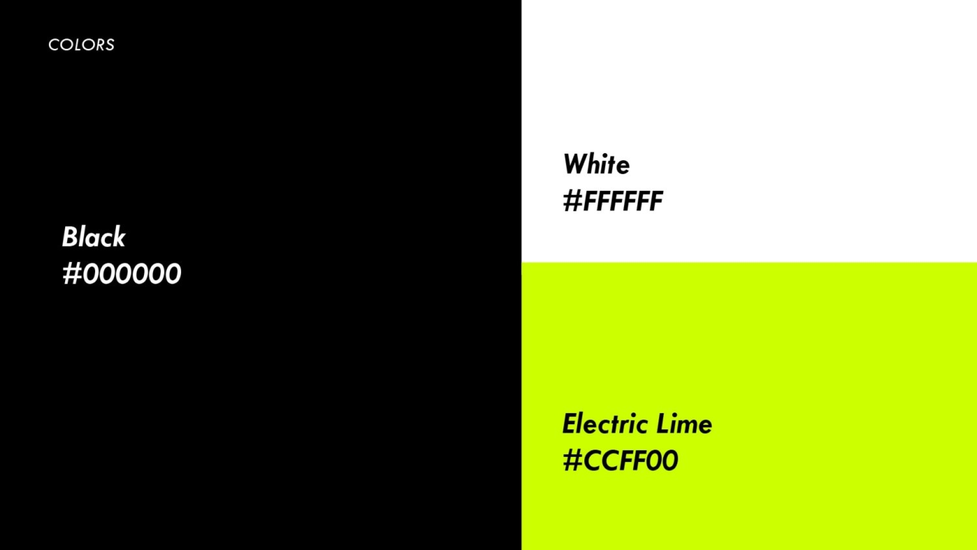
"Black and white are the colors of health and cleanliness, while Electric Lime brings out the energy of fitness and movement. Using these colors in the brand guideline for Fitness Zone will help people know what it's about without having to read too much text on the website or in marketing materials."
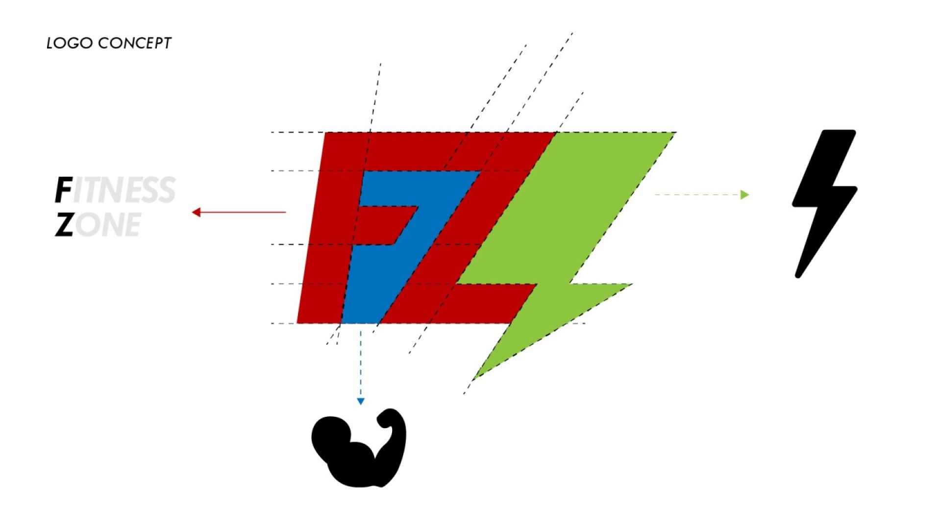
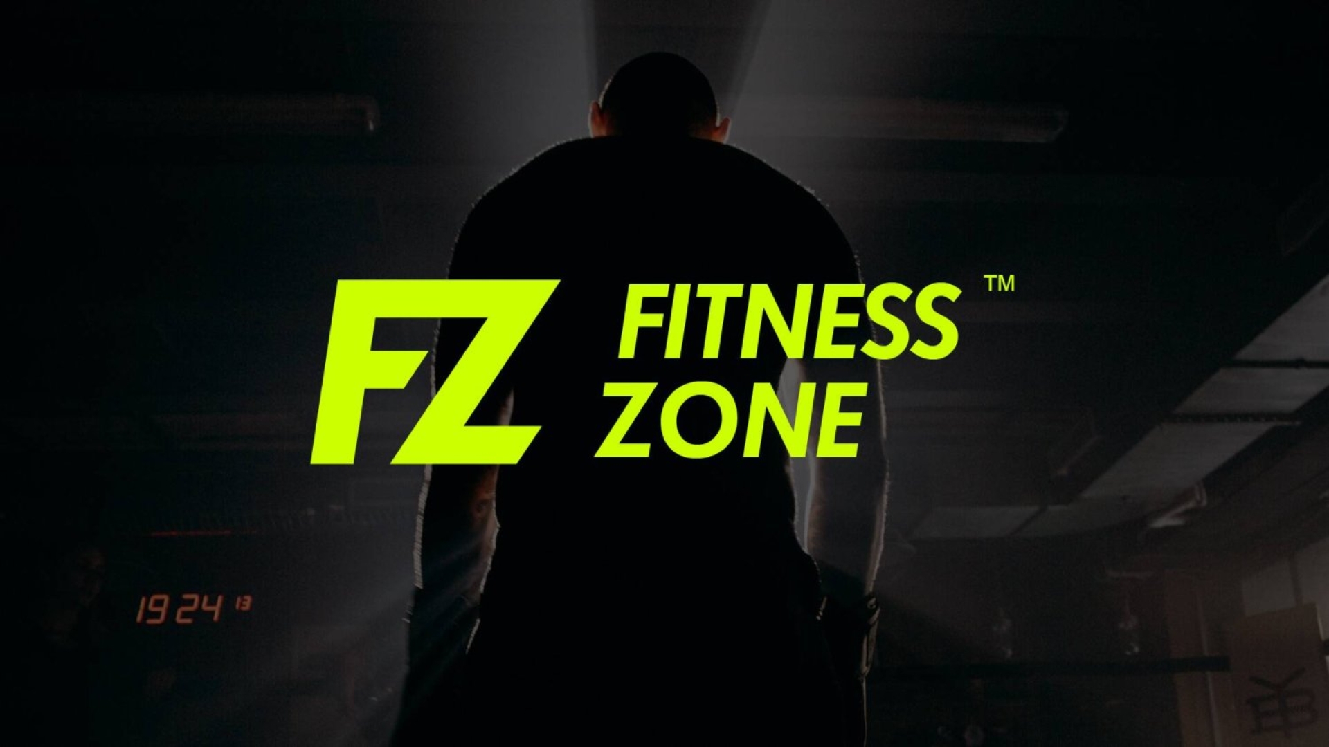
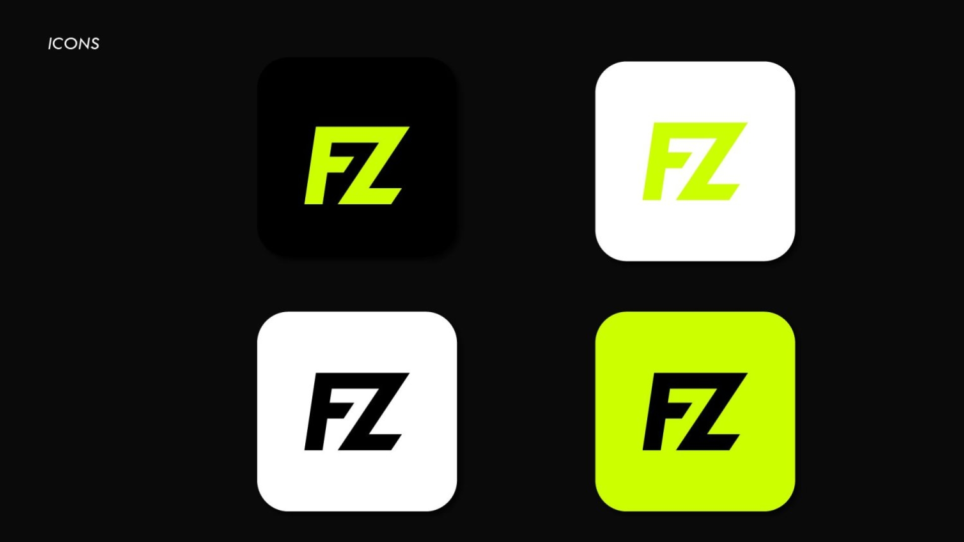
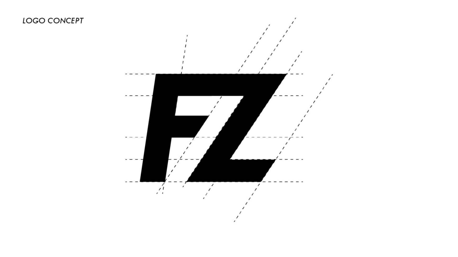
"F and Z creates a unique design that is both modern and timeless. The fact that these letters are also in common use makes this design even more impressive. The modern-looking font combines with a simple, geometric shape that gives the idea of fitness."
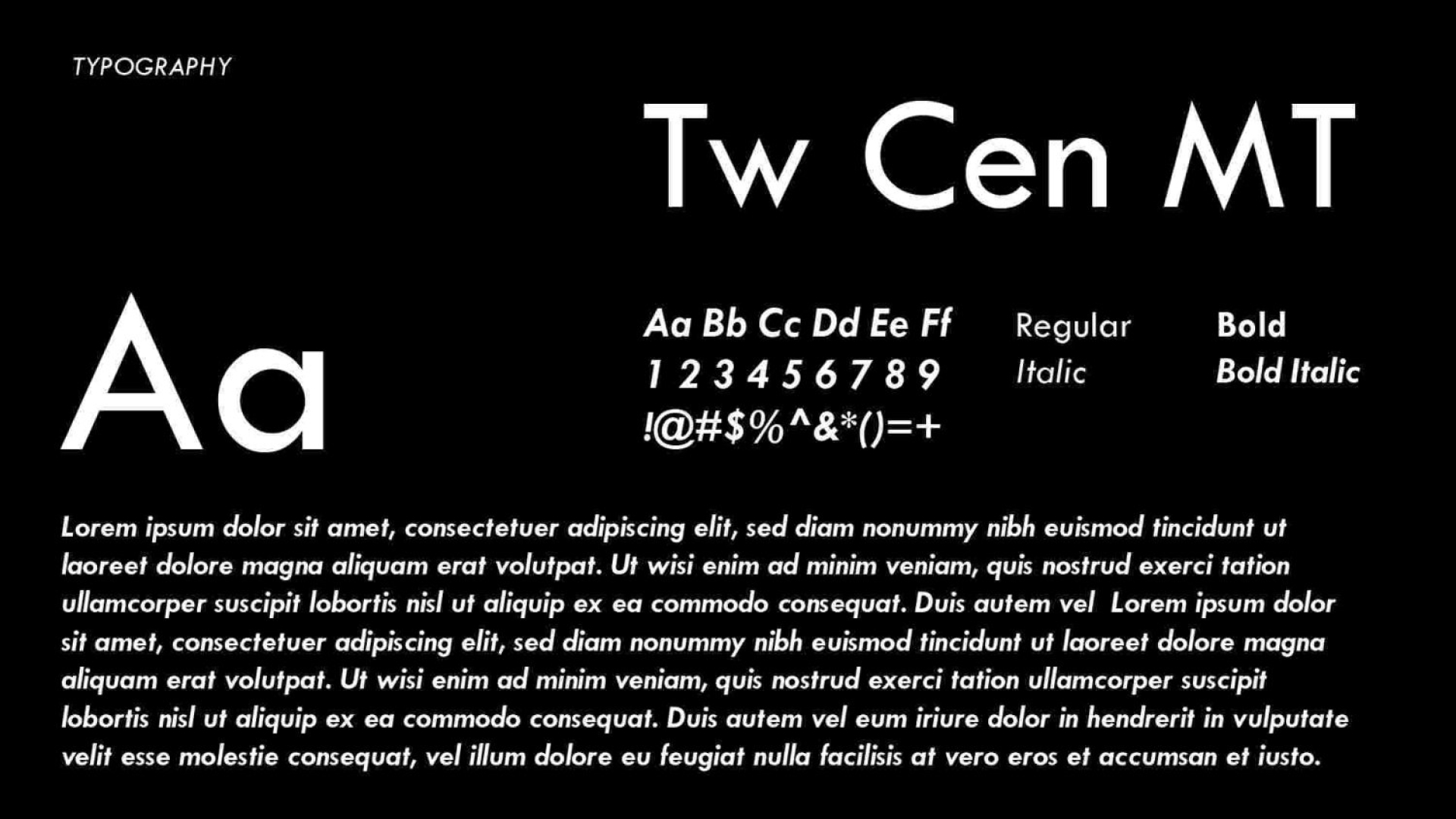
"We wanted to make sure that the brand guideline for FITNESS ZONE was clear, concise, and easy to follow. We chose italic because it's a formal style of writing used in business settings, but it has a friendly vibe that you might associate with something fun or playful."