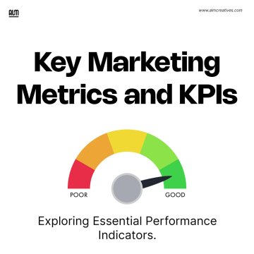
Search
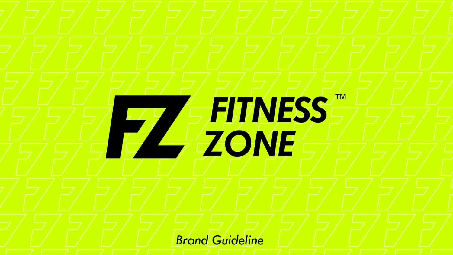
A Modern and Dynamic Fitness Center Brand Guideline That Speaks To The Era
Business and advices
When FITNESS ZONE opened its doors, they didn't know what to expect. They had a vision: a modern, dynamic brand guideline that reflected their employees' professionalism and modernism. But the journey of finding that was long and often discouraging—until they found ALM Creative Studios.
"It took my business from Point A to Point B," said their CEO. "We wanted a brand guideline that was dynamic, modern, and professional."
But as anyone who's ever worked with a design company knows, finding one is not always easy. Many companies will promise you the world, but when it comes to actually delivering on those promises, Not so much.
So how did this fitness center find the perfect partner? By doing some research on their own first! FITNESS ZONE had already done some research into their competitors' brand guidelines before hiring ALM Creative Studios. They found that many of them were bland or outdated (or both), which led them to believe that they needed something fresh and new—something that would appeal to their customers while still reflecting their own personality.
After spending some time learning about what makes an effective brand guideline, they decided to hire the services of ALM Creative Studios.
Company Description
Fitness Zone is a Center dedicated to the development and maintenance of the body's muscles. It allows sports professionals as well as amateurs to maintain their body and keep an optimal body shape.
Details About the Project
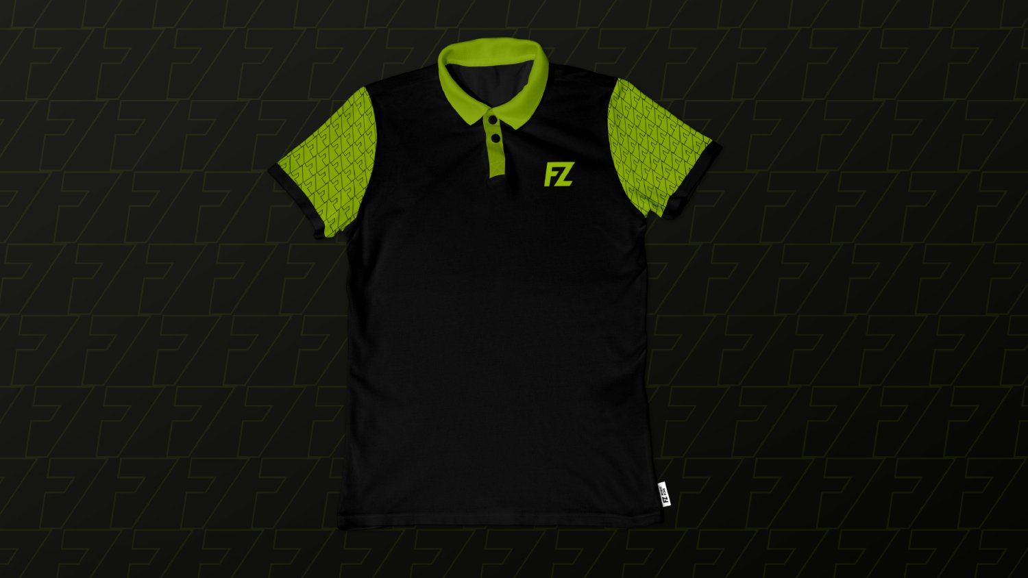
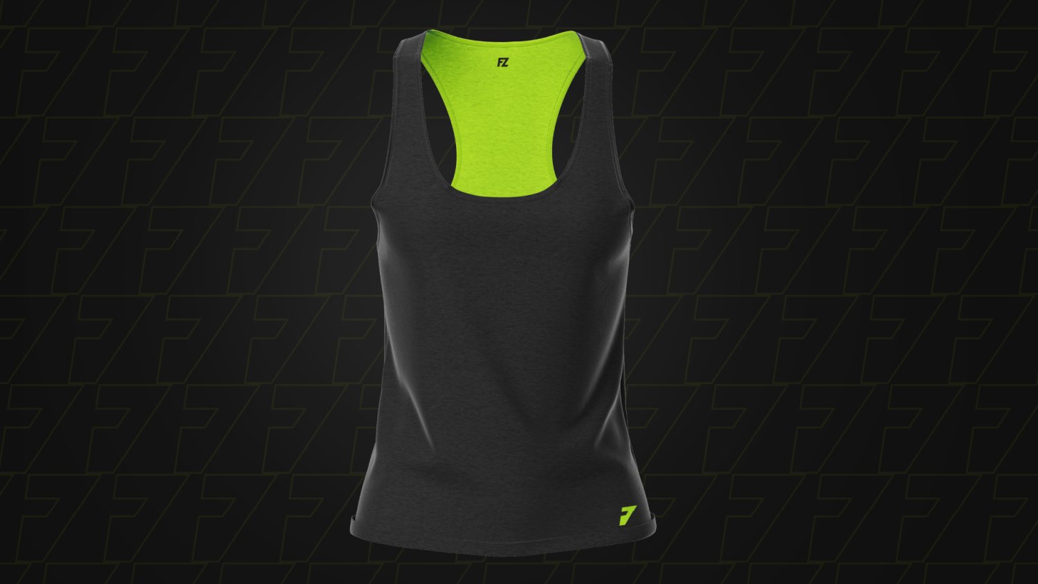
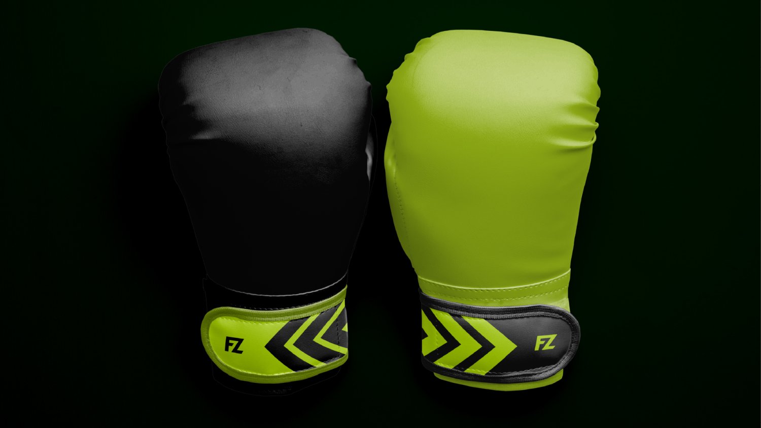
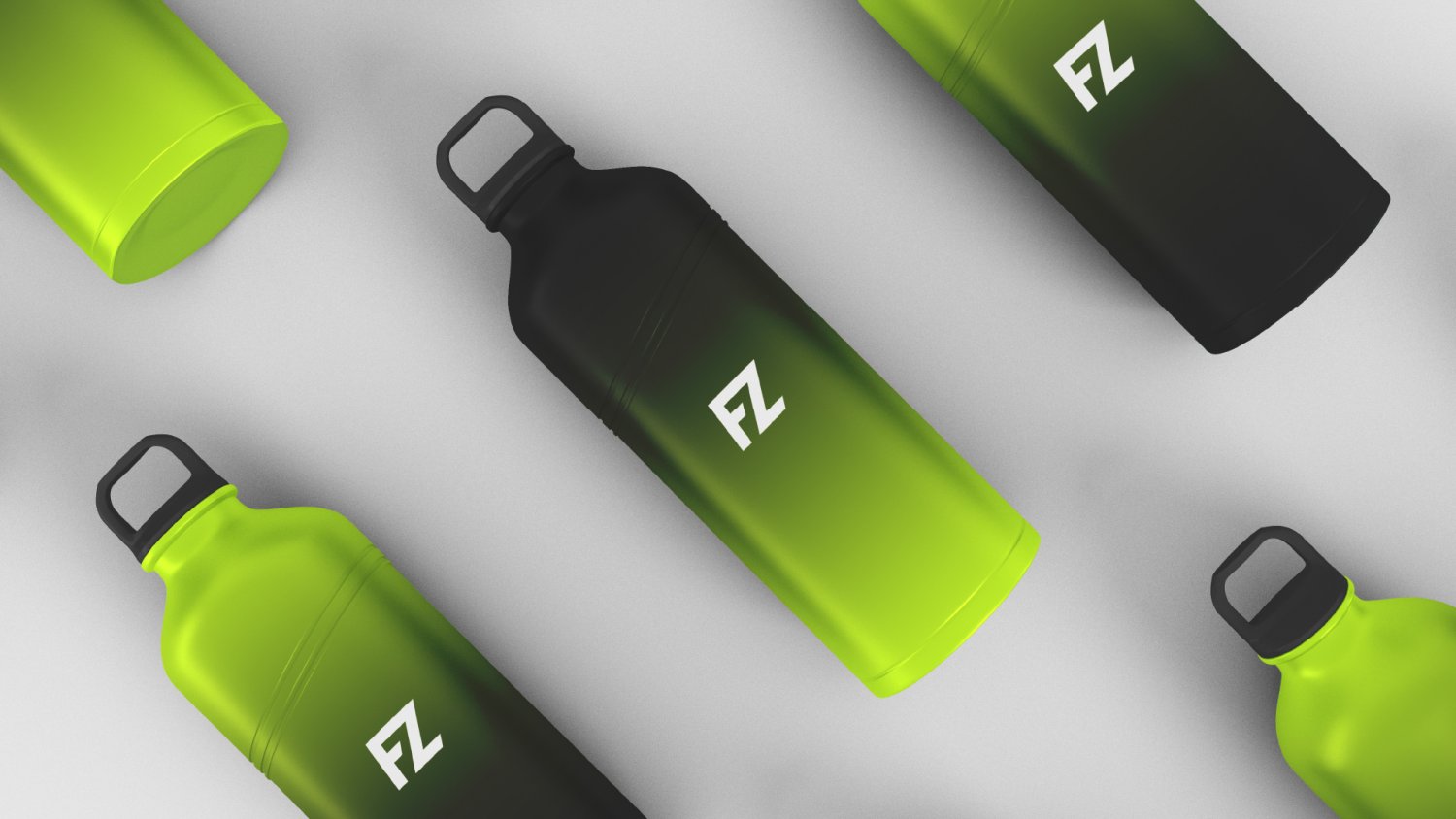
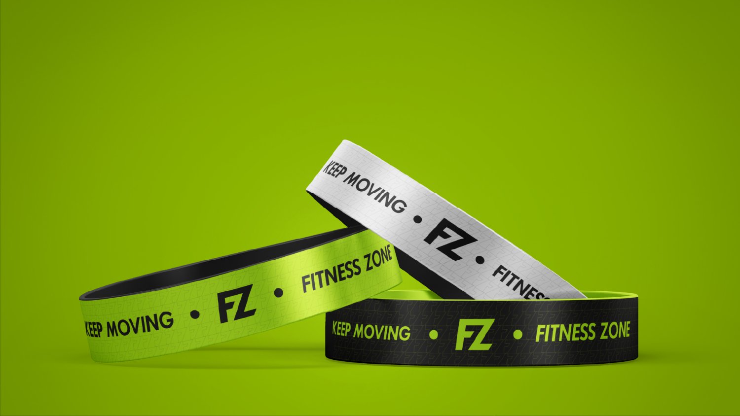
A. Color
Oyono Emile, the graphic designer behind Fitness Zone's new brand guideline, decided to use Black, white and Electric Lime to design the brand guideline because they were the best options for creating a clean and crisp appearance that would still be able to convey their message across all mediums.
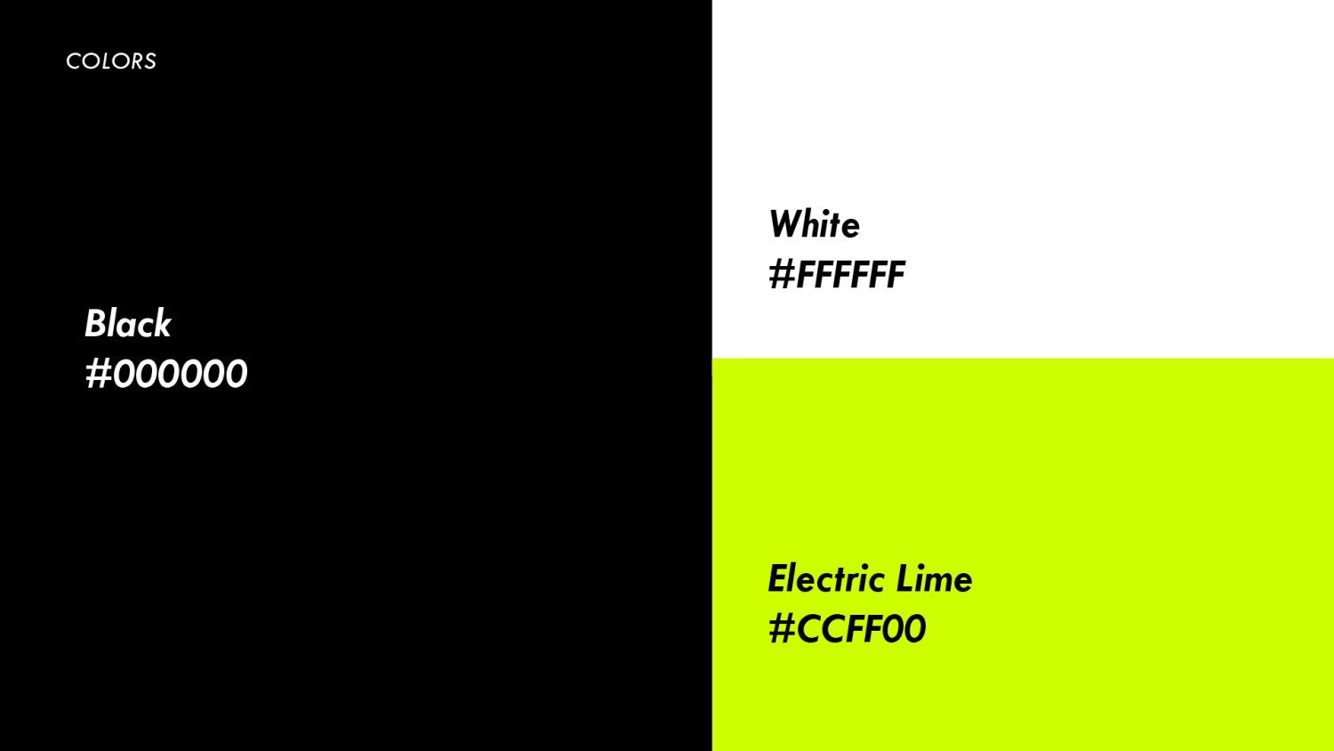
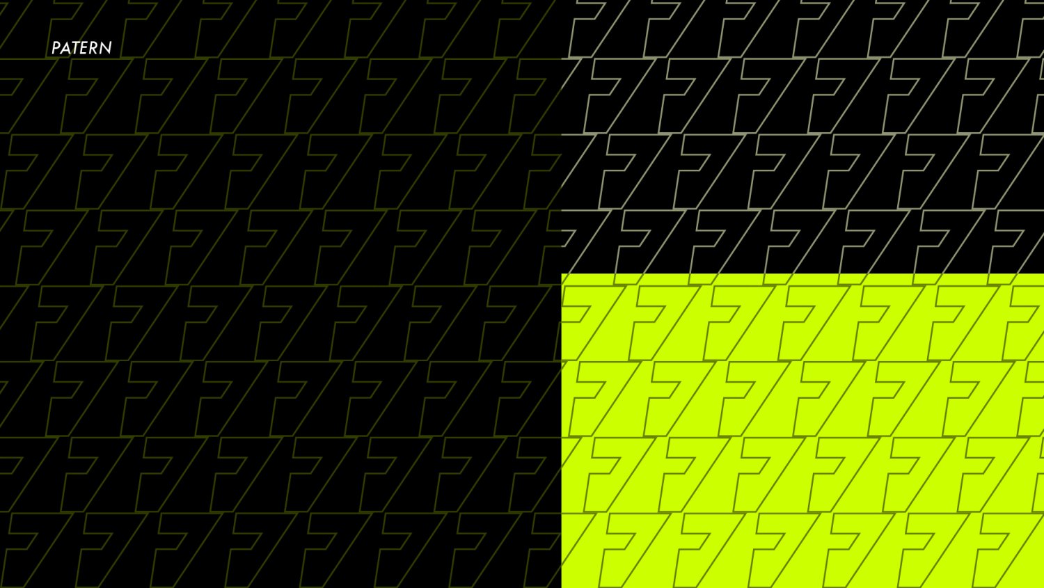
The reason for this is simple: Black and white are the colors of health and cleanliness, while Electric Lime brings out the energy of fitness and movement. Using these colors in the brand guideline for Fitness Zone will help people know what it's about without having to read too much text on the website or in marketing materials.
This makes it easy for people who are interested in buying from Fitness Zone but don't know much about it yet to get an idea of what their product is about without having to read any more than they need to.
"The fact that we could create a guideline using only three colors was very exciting for us," says Oyono Emile. "It allowed us to remain true to our principles while also creating something that looked pretty cool."
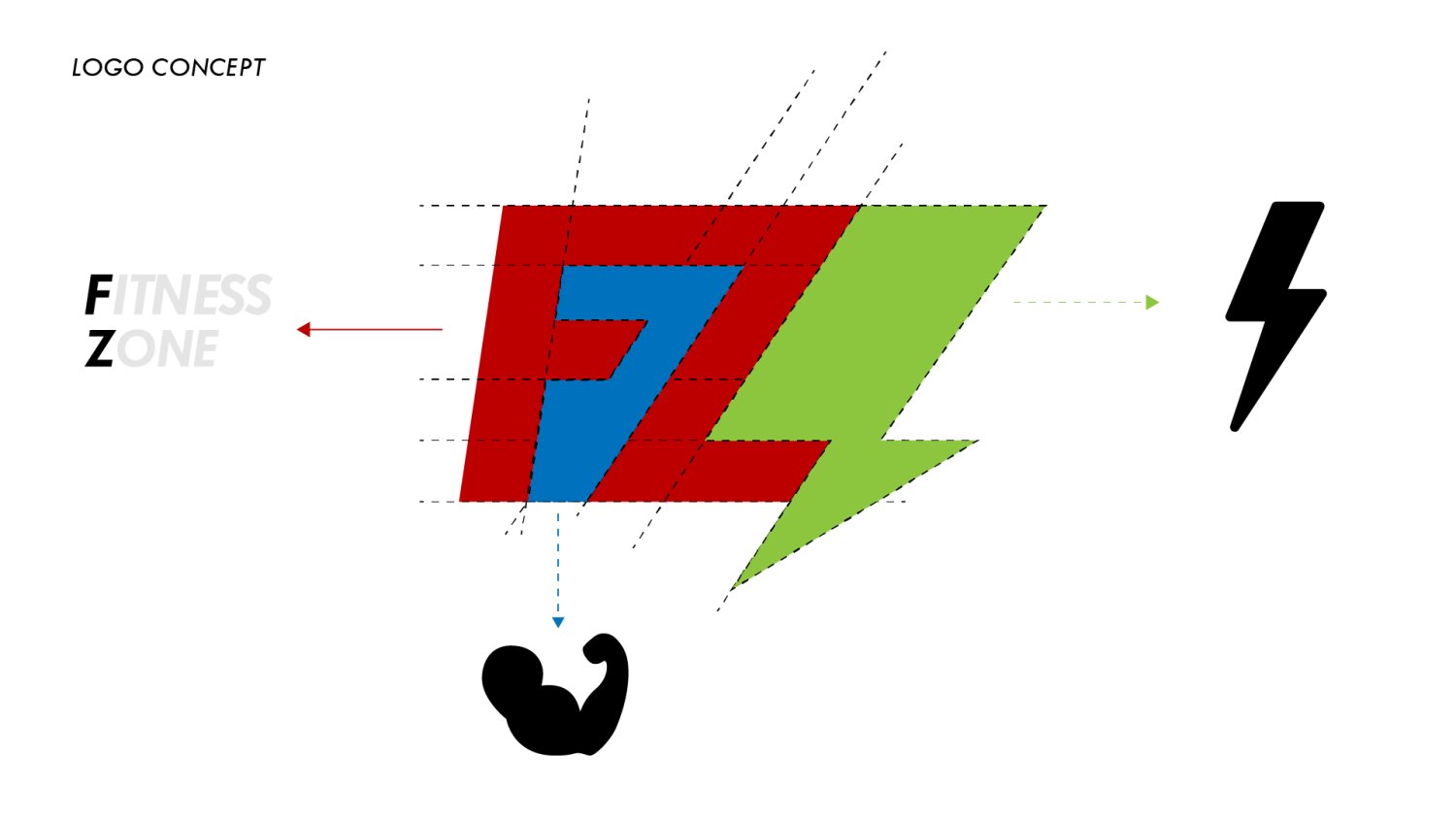
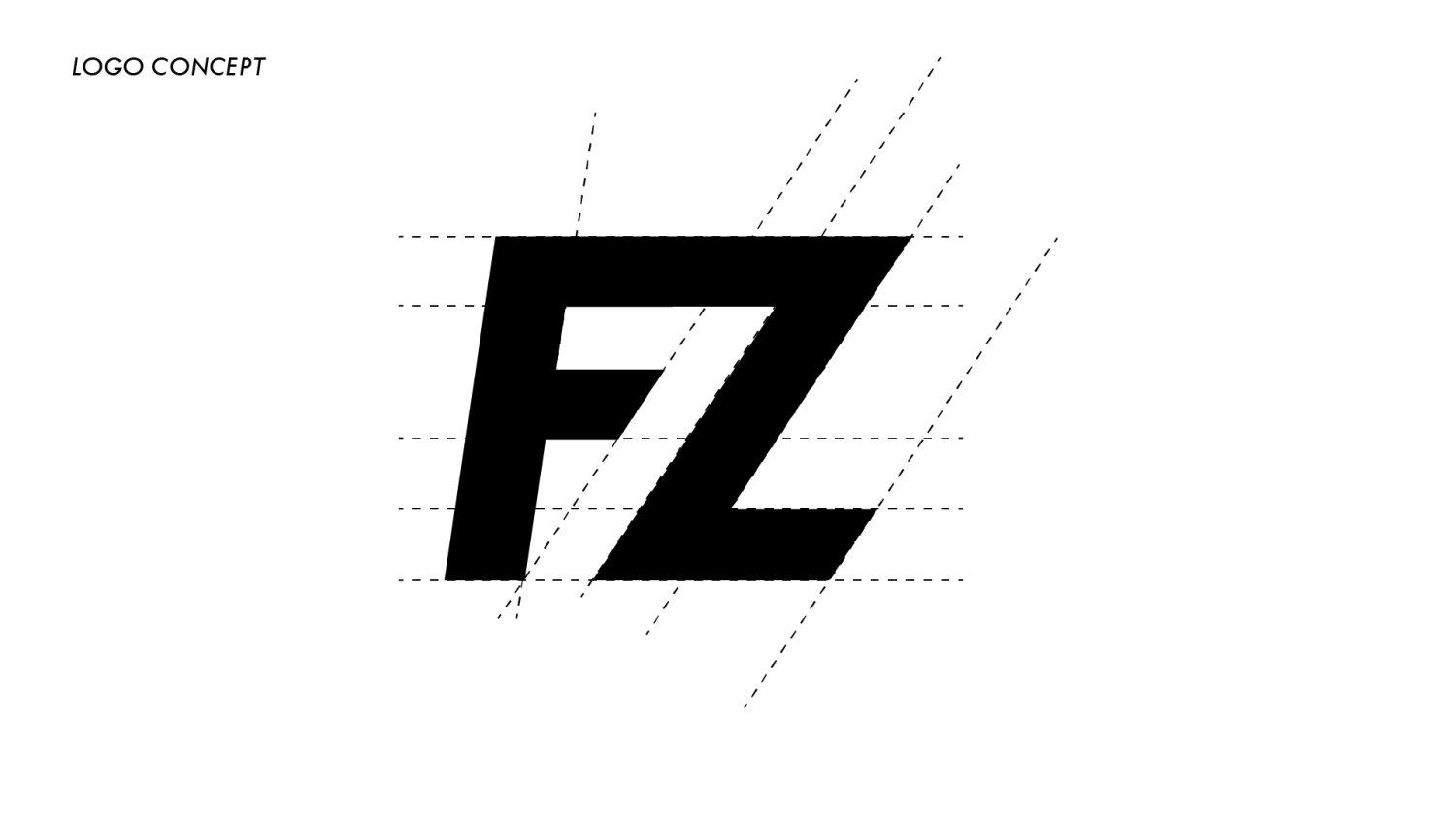
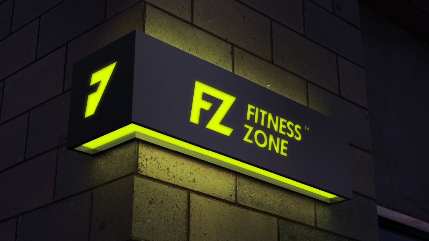
B. Logo Concept
Emile used F and Z to create a unique design that is both modern and timeless. The fact that these letters are also in common use makes this design even more impressive. The modern-looking font combines with a simple, geometric shape that gives the idea of fitness.
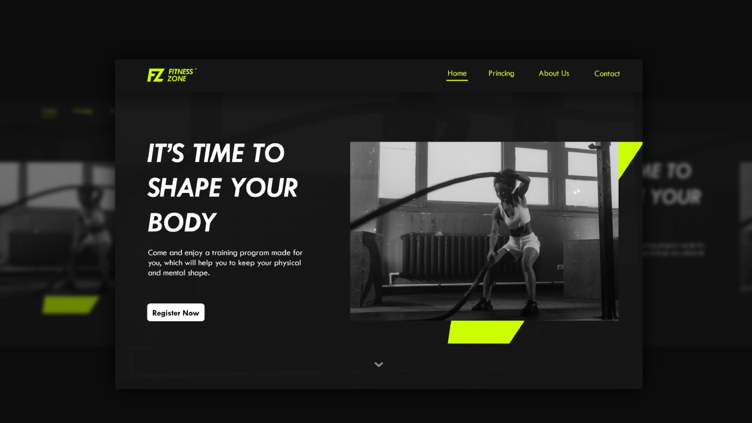
C. Typography
We wanted to make sure that the brand guideline for FITNESS ZONE was clear, concise, and easy to follow. We chose italic because it's a formal style of writing used in business settings, but it has a friendly vibe that you might associate with something fun or playful.

The most obvious benefit of using this font is that it helps to stand out from other brands. Commercials and websites that use this font tend to be more memorable than those who don't use it. The FITNESS ZONE logo uses italic as well, which makes it even more recognizable by consumers.
D. Preview on Different Surfaces

"I would like to conclude by thanking everyone who participated in this exercise.
I appreciate all your help and support, and I would like to thank the FITNESS ZONE team for being such a great team. We are all proud of our work together and we hope that it will make a difference to the people who visit our fitness center." concluded Emile.