Search
UrPharm
Brand identity
UrPharm is a mobile app that helps people to locate the nearest pharmacy and informs users about the drugs available and prices.
Four (4) Logo proposals were made for UrPharm in a bid to bring out the values they offer and make it visible in the logo. In as much as the proposals were not adopted because the initial logo already had an ongoing campaign around it, the proposals were highly recommended by many
We maintained their colors when developping the proposed logo concepts.
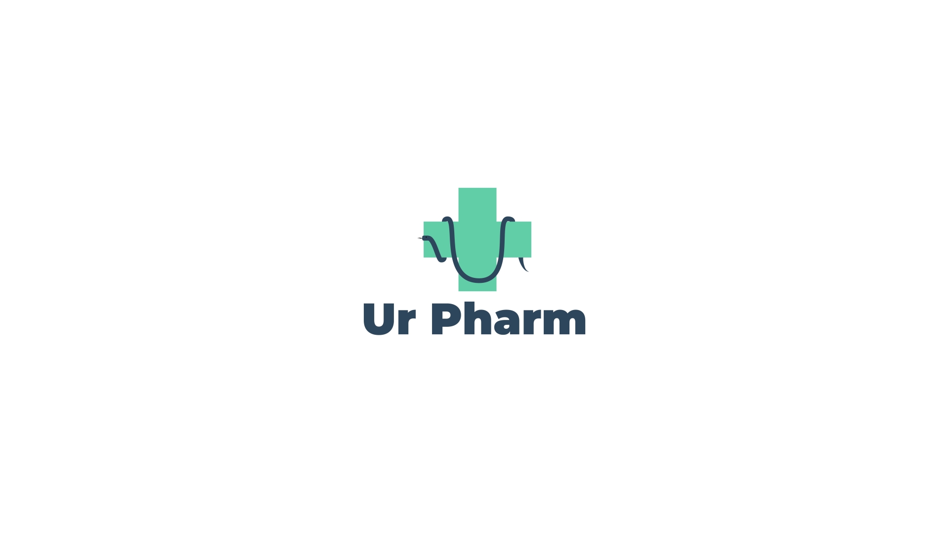

The first proposition is a plus sign with a snake hanging on it. Here we wanted something that will correctly represent health. And on the plus (+) sign, the snake hanging on a pole symbolizes health ( it comes from the Bible, the book of Numbers 21:4). Then from that we came out with a logo composed of a plus sign and a snake hanging on it in a U curve which is the first letter of the application's name.
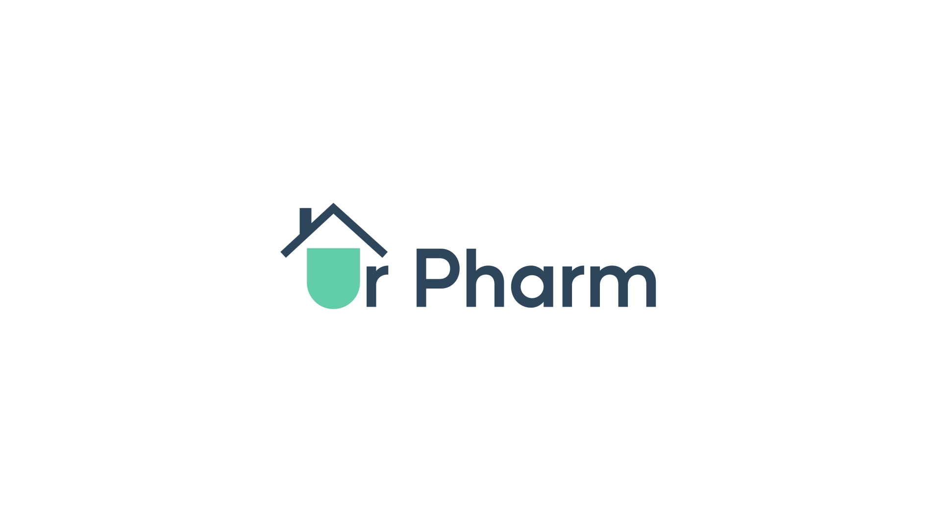
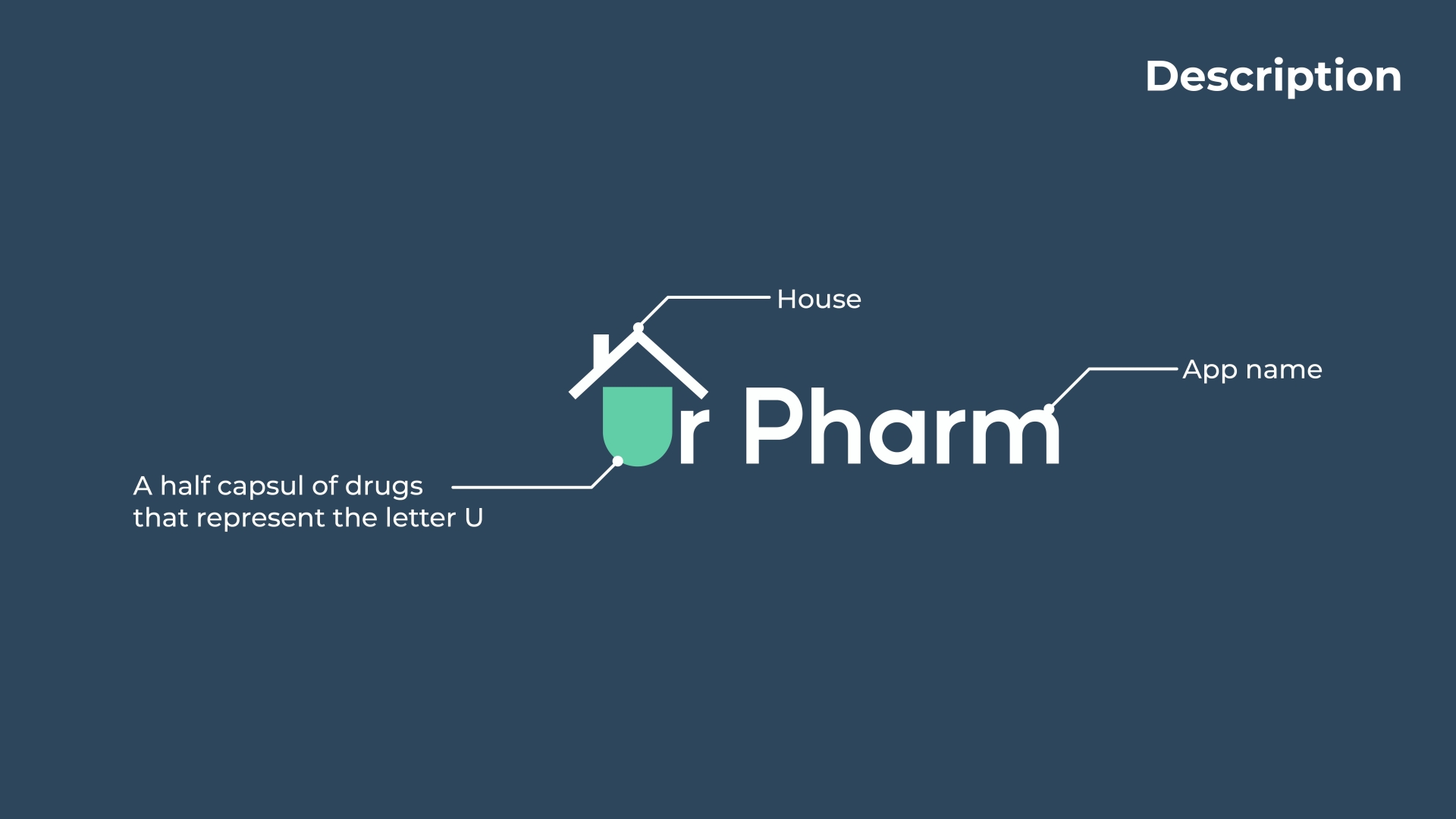
For the second proposition we went with the name of the application: UrPharm which means "your pharmacy". From that we created a logo which signifies users have their pharmacy at home with them. So, we illustrated that with a house on the logo covering the Ur.
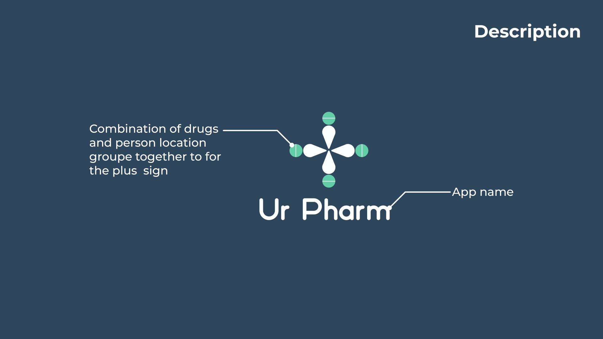
For the third logo we wanted to express the fact that people’s medications are with them everywhere they go. This came about the combination of medication and the location sign showing what the brand does, then we brought them together to form a cross to express that medications cure people
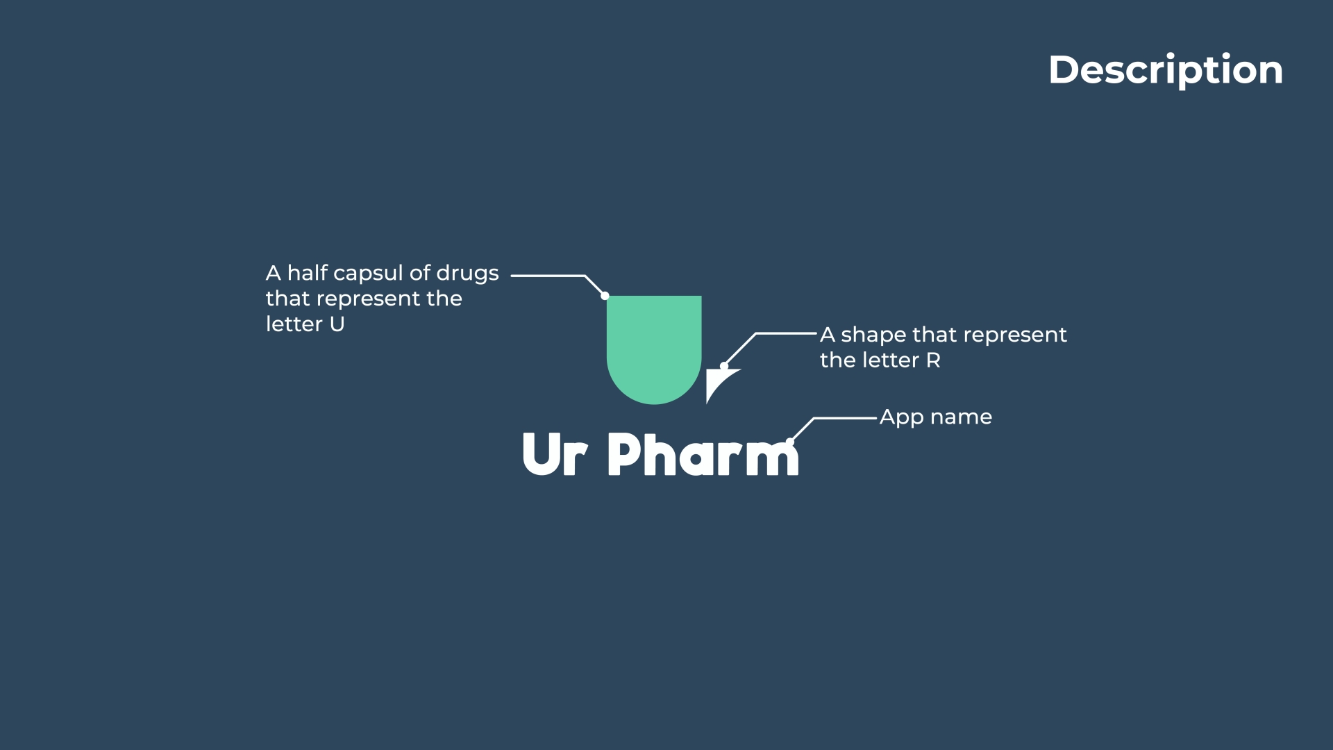
For the fourth logo we wanted to underline and make the users to understand that it is their pharmacy, that it is for them and it is at their disposal the reason why we highlight the Ur of UrPharm and used it as logo mark
