Search
Case Study: Logo Design for Smartways Property Management (SPM)
Marketing
Company Description:
Smartways Property Management (SPM) is a leading property management company based in Cameroon.
The Company offers a wide range of property management services, including property marketing, tenant screening, rent collection, maintenance and repair, financial reporting, and legal compliance.
SPM targets high-income individuals, expatriates, diplomats, and property owners/investors seeking professional management services.
Objectives:
SPM approached us with the objective of developing a visually appealing and impactful logo that would effectively represent their brand and resonate with their target audience.
"They desired a logo that conveyed trust, professionalism, and a sense of luxury to attract their target market."
Our Process:
We adopted a comprehensive and strategic approach to the logo design project. The process involved several stages:
1. Research and Discovery:

We conducted in-depth research into SPM's brand identity, target audience, and the luxury property management industry in Cameroon. We analyzed their competitors, market trends and gathered insights to inform the design process.
The research stage plays a crucial role in the logo design process by ensuring that your logo sets itself apart from competitors, making it highly distinctive.
2. Sketching & Development:
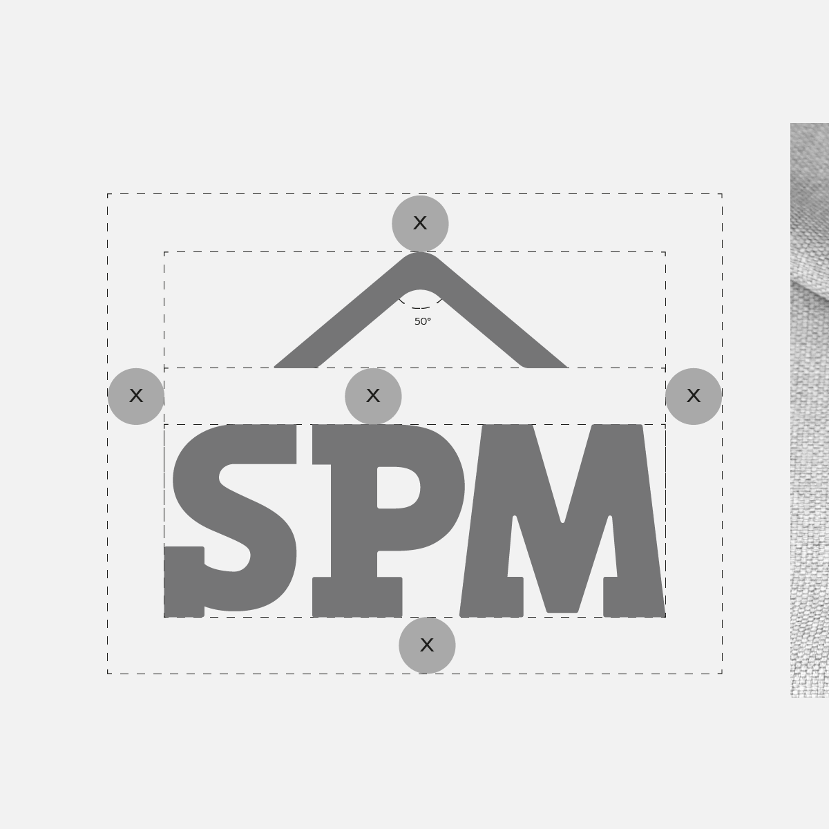
Our creatives brainstormed and sketched various logo concepts inspired by SPM's brand identity and target audience. They explored different visual elements, typography styles, and symbols that could effectively communicate SPM's values of trust, professionalism, and luxury.
3. Color:
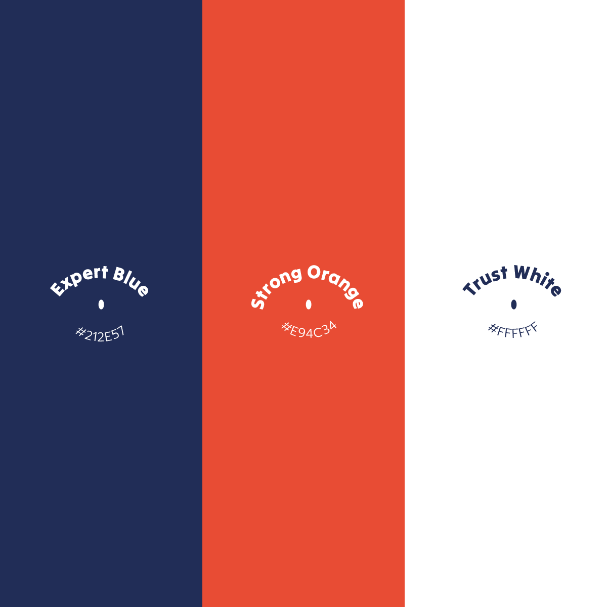
Color plays a vital role in the logo design for Smartways Property Management (SPM), as it helps evoke specific emotions and perceptions in the target audience. Our Creatives carefully selected and incorporated the following colors into the SPM logo design:
a. Expert Blue (#212E57)
The use of Expert Blue conveys professionalism, expertise, and trustworthiness, which are essential qualities for a property management company.
b. Strong Orange (#E94C34)
The inclusion of Strong Orange brings vibrancy, energy, and enthusiasm to the SPM logo.
c. Trust White (#FFFFFF)
White is incorporated into the logo design to represent purity, cleanliness, and integrity. It signifies the transparency and honesty with which SPM conducts its business operations.
4. Refinement & Iteration:
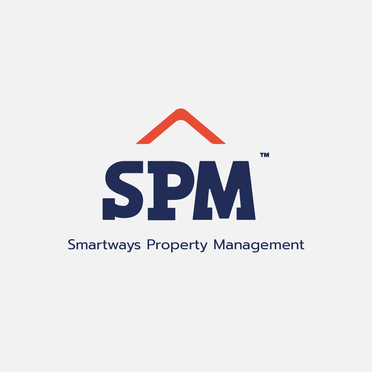
We presented the initial logo concepts to SPM and gathered their feedback. Through collaborative discussions, we refined and iterated on the designs, focusing on capturing the essence of trust, professionalism, and luxury.
5. Finalization & Delivery:
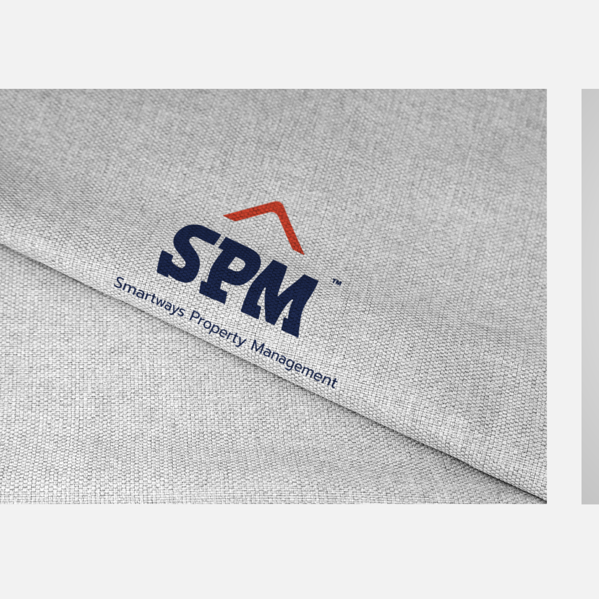
After several rounds of refinement, we arrived at the perfect logo design that encapsulated SPM's brand identity and resonated with its target audience. The final logo design showcased a sleek and sophisticated typography style, incorporating carefully selected colors—Expert Blue, Strong Orange, and Trust White.
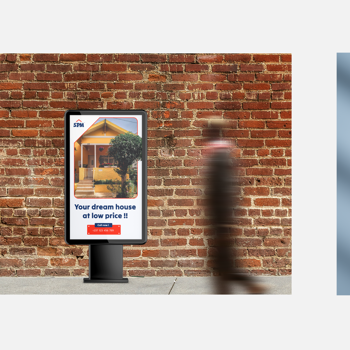
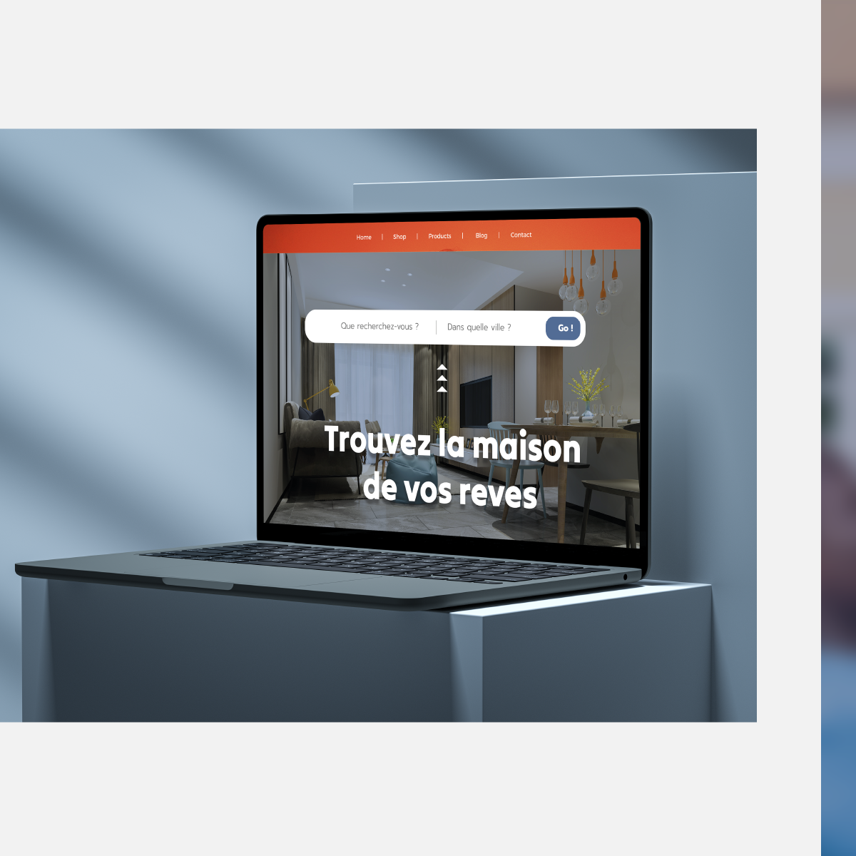
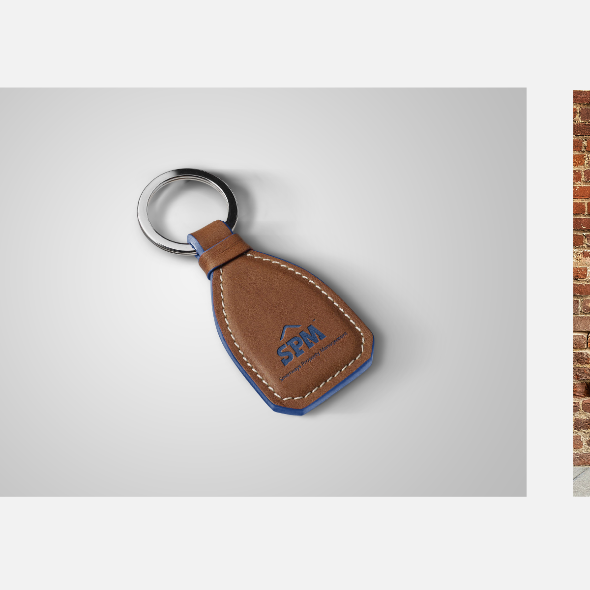
6. The Logo in use:

Conclusion:
Our collaboration with Smartways Property Management (SPM) in designing their logo has been instrumental in enhancing their brand identity and attracting their desired clientele.
The strategic selection of colors—Expert Blue, Strong Orange, and Trust White—combined with sleek typography, has resulted in a visually captivating and impactful logo that conveys professionalism, trustworthiness, and luxury.
The success of the logo design project is evident in the increased brand awareness, recognition, and positive response from SPM's target audience.
Our commitment to delivering exceptional design solutions has propelled Smartways Property Management to new heights, solidifying its position as a leader in the property management industry in Cameroon.
