Search
Gravity
Brand identity, Naming
Gravity is a photography and videography company which trusted ALM Creative Studio with the task of designing a logo which reflects safety and softness, at the same time, simplicity inside complexity
Gravity is a photography and videography company whose brand identity was handled by the ALM Creative team. As part of the project, we came out with the perfect logo design that represented the brand's vision totally.
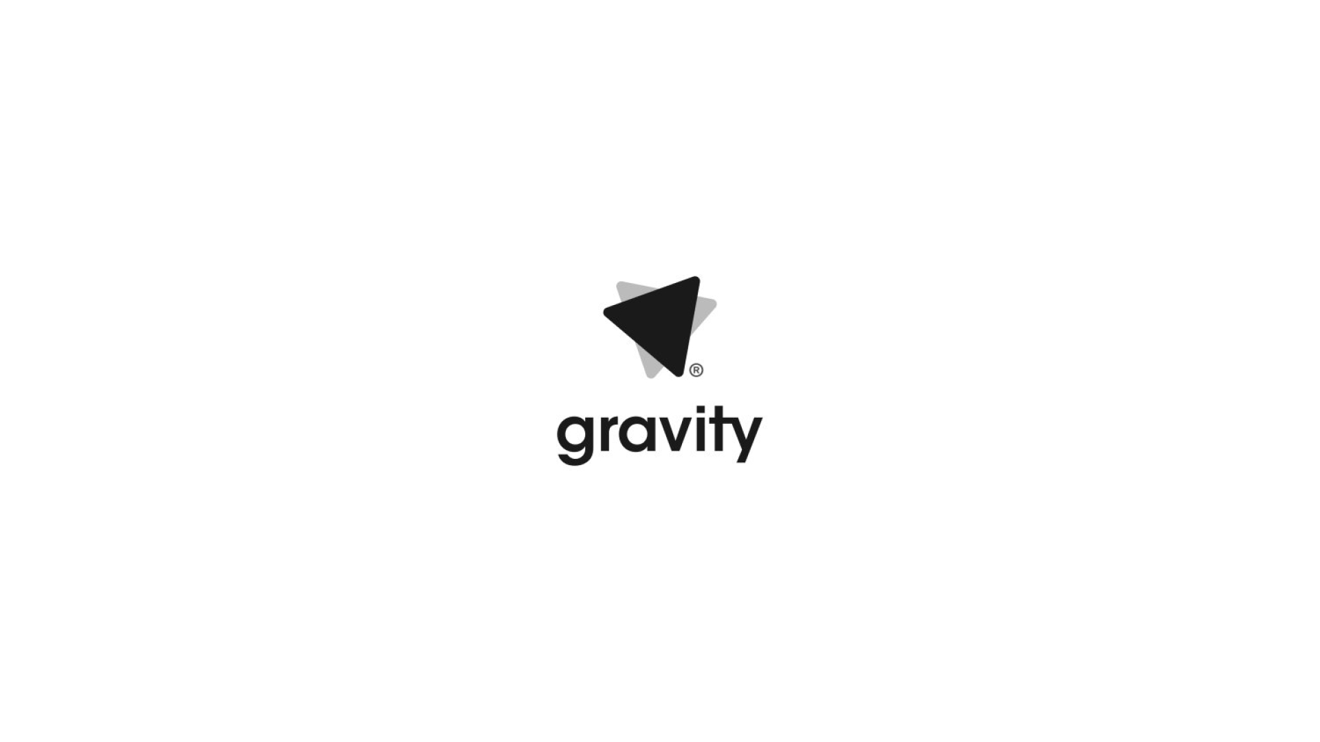
The logomark is an abstract mark, a combination of two geometric shapes which represent arrows, the arrows of a compass. The designers let their imaginations run wild when drawing the custom typeface, which contains two parallel objects.
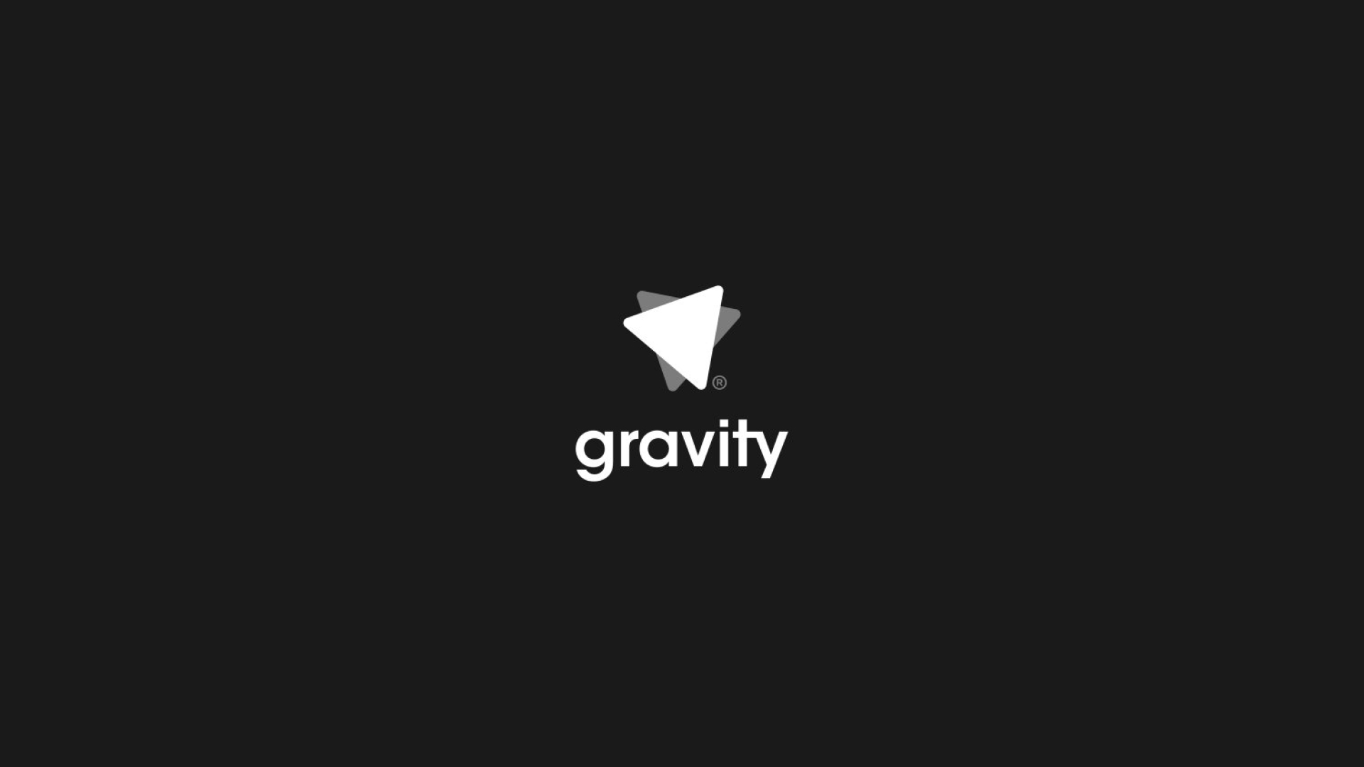
An entire alphabet was developed for the set of letters, with floating attirbutes. The final logo strikes a balance, with the transition across from white - grey - black.
Random fact: If you take a compass to space(No gravity), the arrow will be in random spinning motion because of no directional constrains, this explains the second arrow being in a different angle and being lower in opacity representing motion blur.
The ALM Creative Studios designers collaborated closely on the project with Ngong Chris on the details to produce a symbol that represence the vision of the project. Not yet in the market but the logo has been highly appreciated by top designers world-wide
The logomark is an abstract mark, a combination of two geometric shapes which represent arrows, the arrows of a compass. None of these arrows point to any of the actual terminals of a compass, that is, N, W, E and S. This represents us being above the basic law of direction, We have no constraints as creatives The logo consists of two triangles, the foremost triangle inclined at a degree of 19.74, and the one at back inclined at a degree of 348.83". We are referred to as the people under gravity, while literally being the people under Gravity®
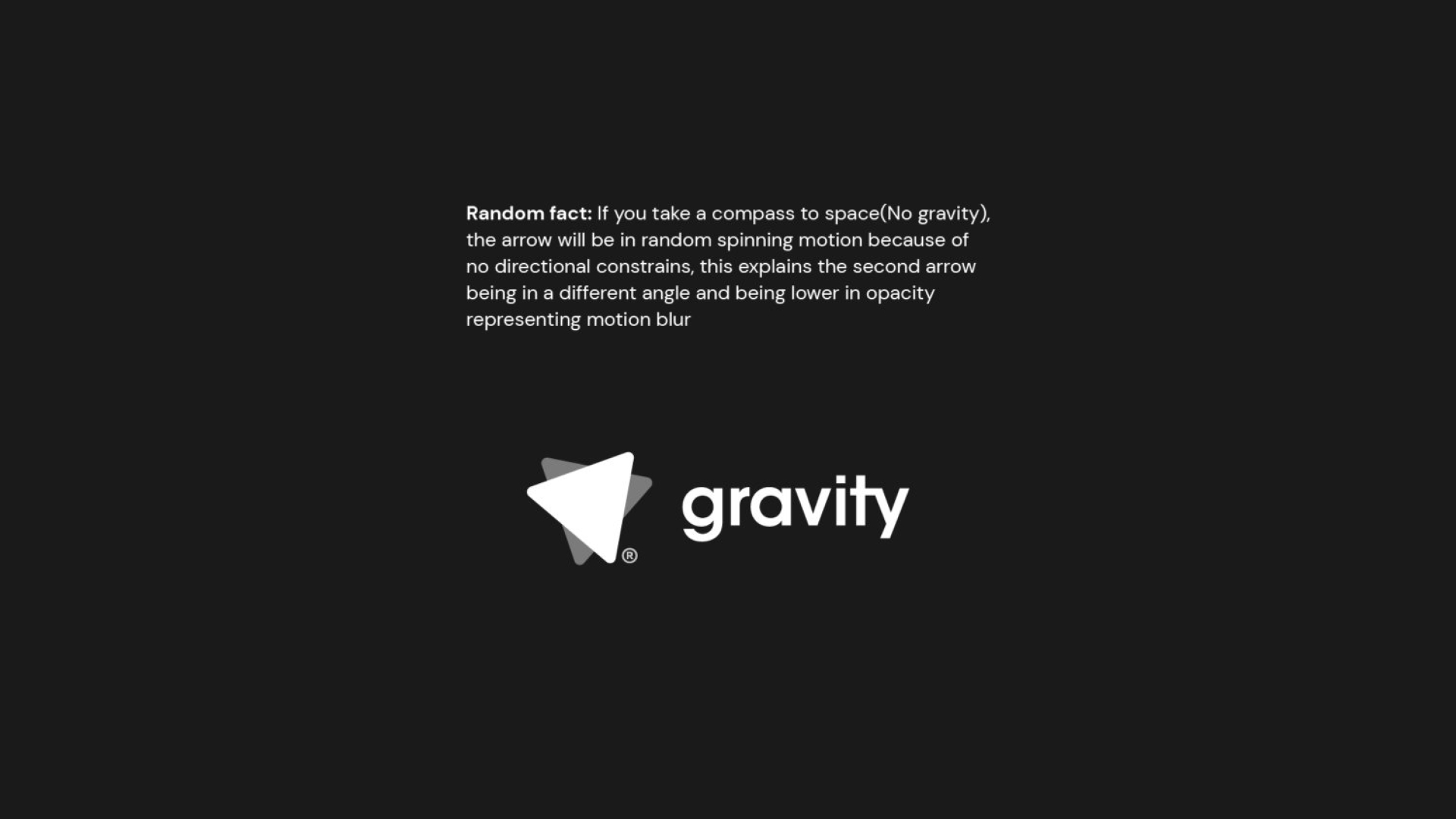
Random fact: If you take a compass to space(No gravity), the arrow will be in random spinning motion because of no directional constrains, this explains the second arrow being in a different angle and being lower in opacity representing motion blur
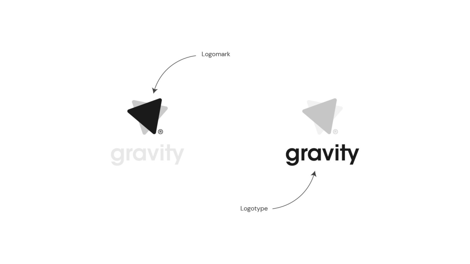
LOGOMARK x LOGOTYPE

VERTICAL x HORIZONTAL