Search
A New Brand Identity for the Cameroon-based TV Program
Business and advices
A television show is only as good as its brand identity. This is what the Cameroon-based TV show C-suite has learned over the years. The show, which airs on multiple channels in Cameroon and other African countries, has been struggling to maintain a consistent brand identity since its inception.
"We don't want our viewers to think that we're just another TV show," said one of the producers of C-suite. "We want them to know that we are different, that we are here to make history."
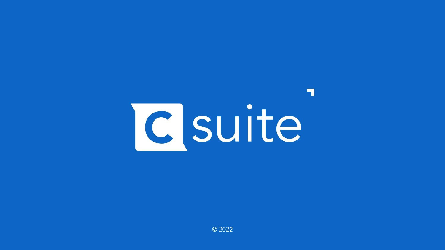
To help them reach this goal, ALM Creative Studios was brought on board by the producers of C-suite. The designers worked with the producers to create an updated logo that would serve as an anchor for their entire visual communication system.
They also designed a set of fonts for use across all platforms and created a style guide with guidelines for how each piece of content should be presented so it would have a cohesive look and feel.
Company Description
C-suite is a TV Program that aims to put the spotlight on C-level executives in an organization, whether they are entrepreneurs or public or private sector workers. Through interviews, the guests will talk about their business activities, present their organizations, and finally, give advice on how to grow a Business.
Details About the Project
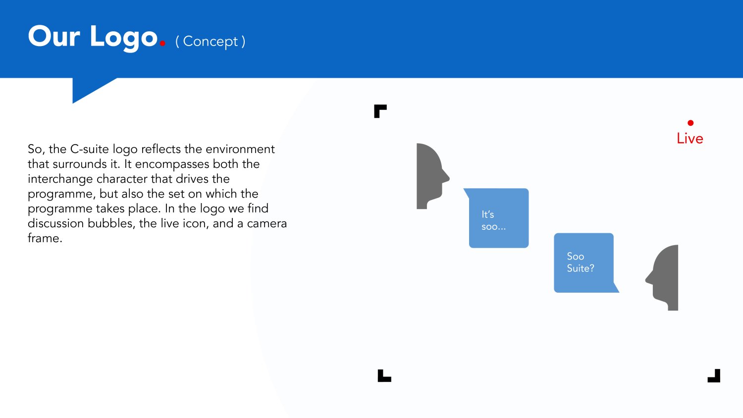
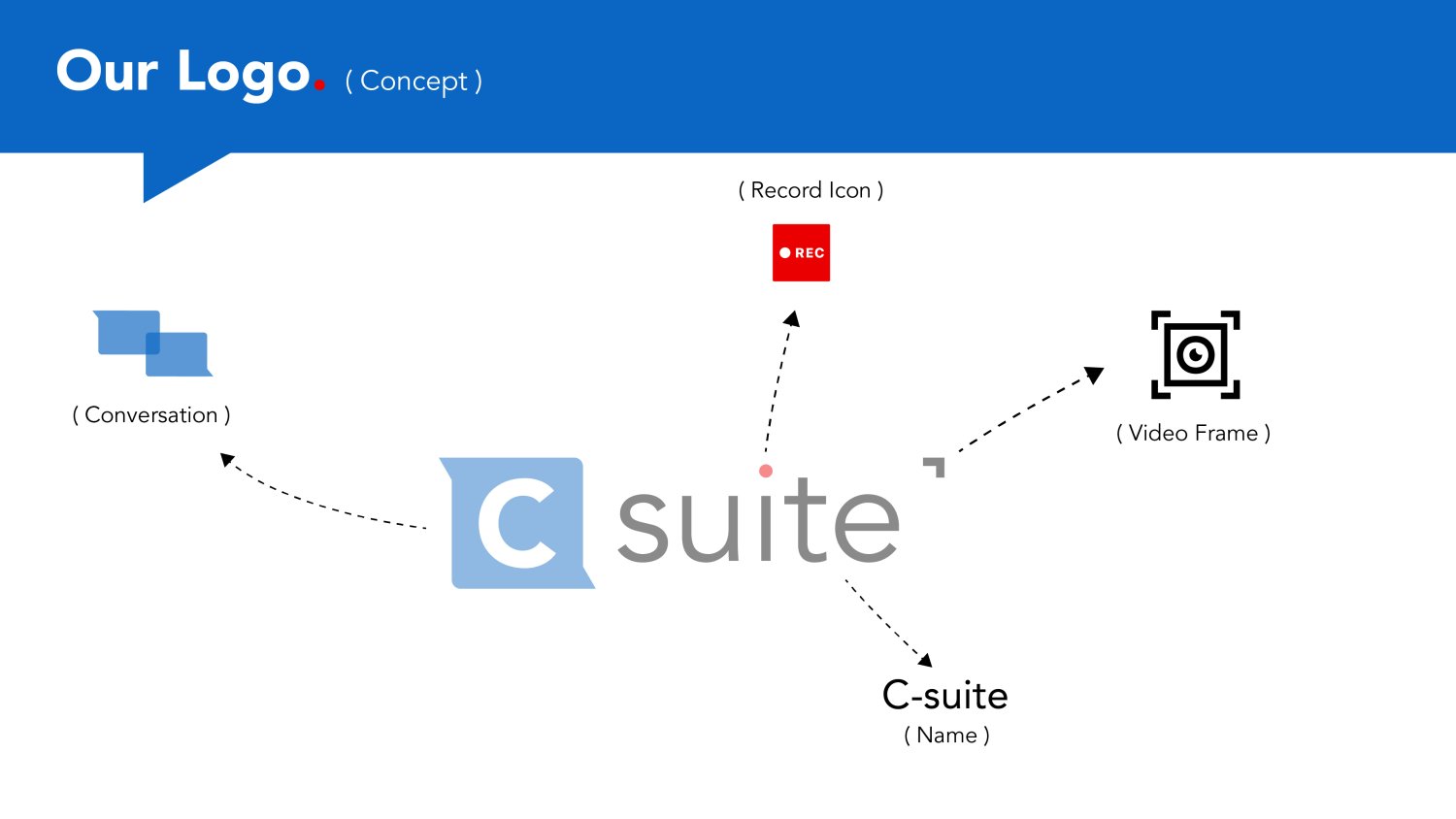
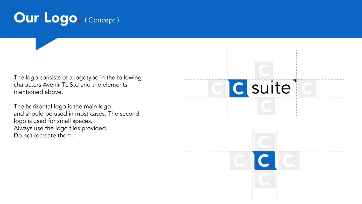
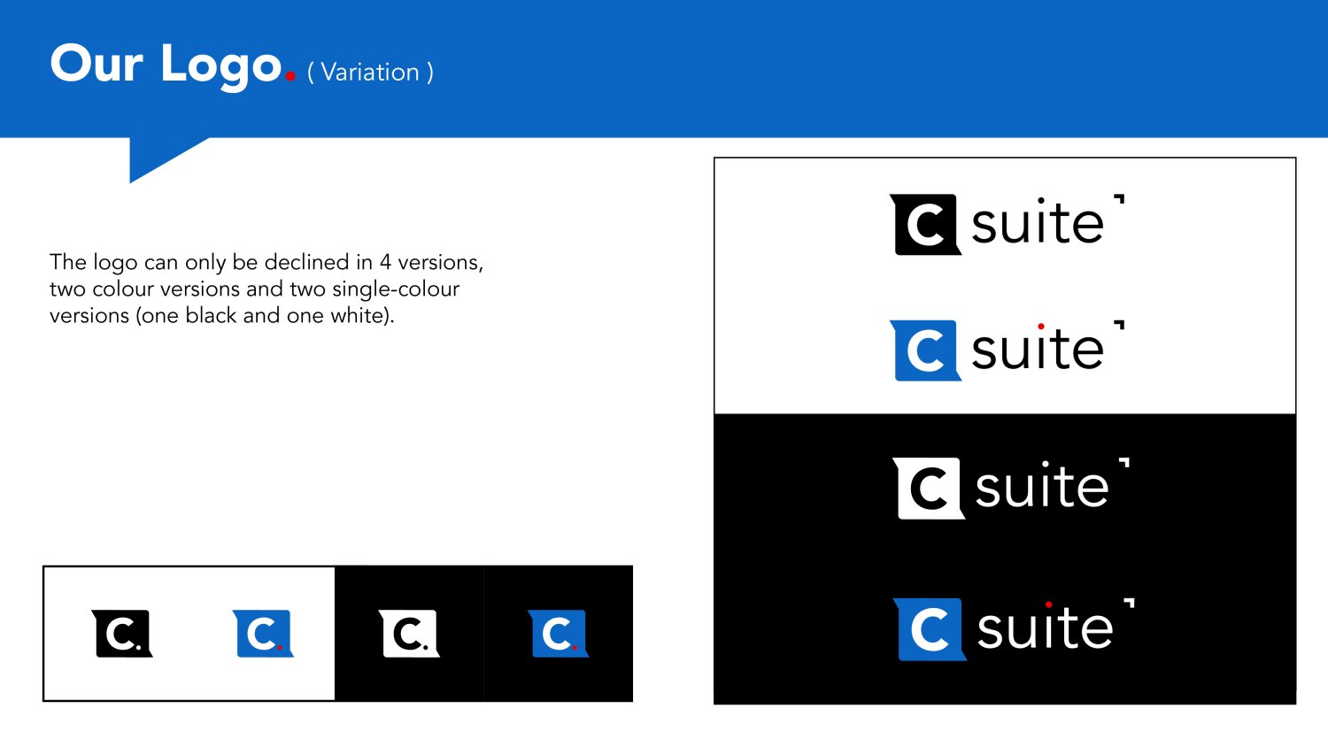
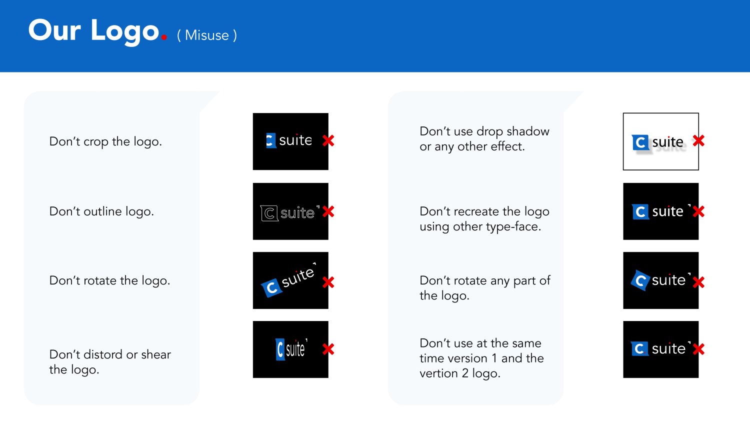
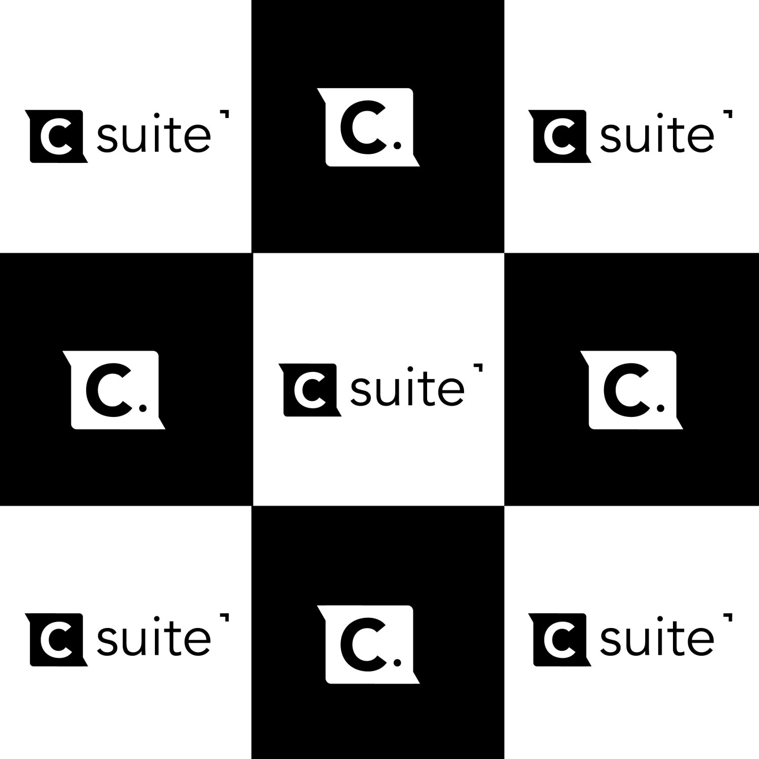
A. Logo Concept
2. Typography
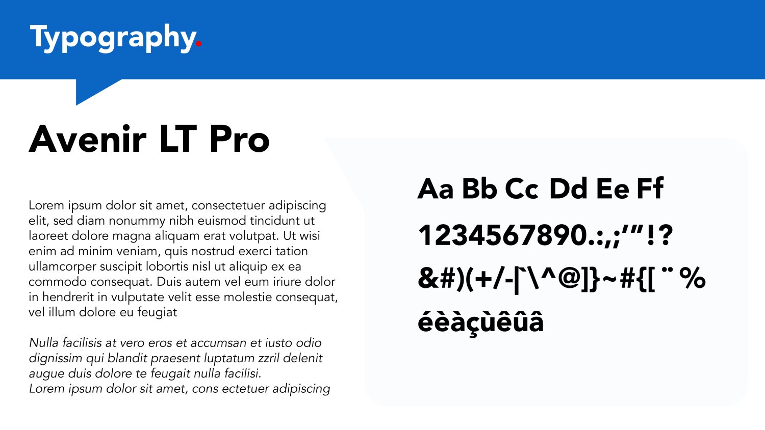
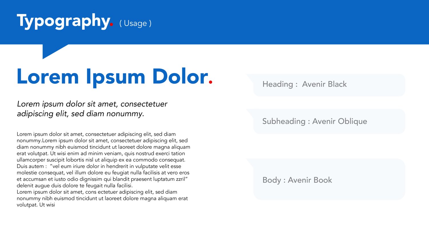
When we started planning the TV show C-suite, we knew we wanted to use Avenir LT Pro for the typography.
Avenir LT Pro has a lot of great features, such as a legible and beautiful italic style, which makes it perfect for television programs that require a sophisticated look. It also has an extensive character set with numerous alternative characters and ligatures that can be used in different ways depending on how your script looks onscreen.
3. Color
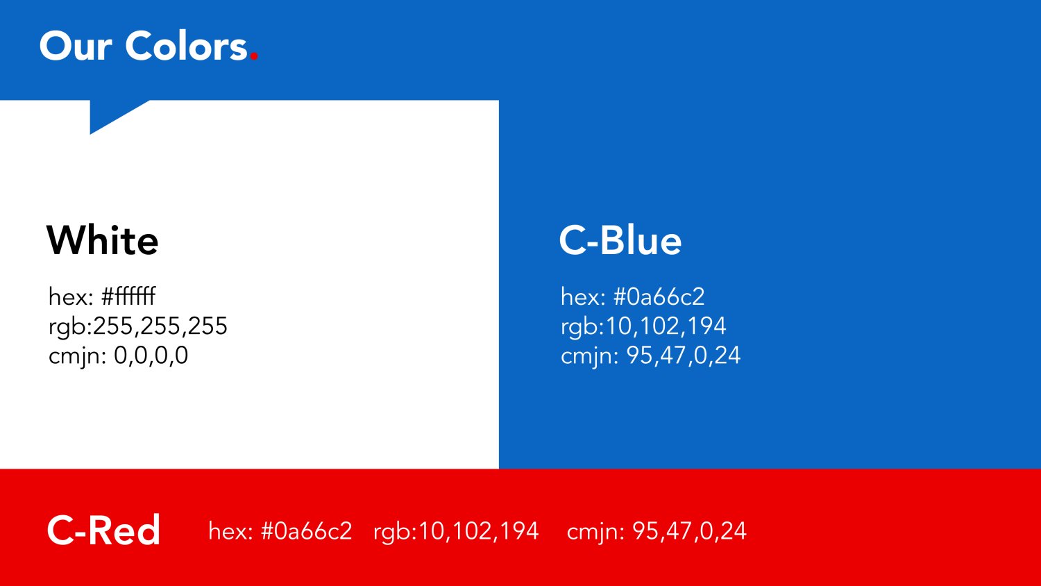
When we were brainstorming the colors for the TV show, C Suite, we knew that we wanted to use white, blue, and red. These three colors have been used in television for a long time—they're iconic, and they work well together. We also wanted something that was new and exciting but still maintained some of the classic qualities of the other two colors.
D. Preview on Different Surfaces
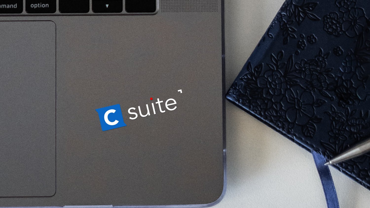

What makes this project stand out to us is that it's something completely different than the typical branding projects that we see day in and day out. We most often get asked to design logos, brands, or identities for actual companies and not TV shows.
It was a challenge to design something that would reflect the corporate culture of these companies but also be accommodating to a television audience. Though we don't usually do branding work for TV shows, it was an enjoyable project that was both fun and exciting for our clients and ourselves.
For more Articles on our works, check out our News Page at www.almcreatives.com.