Search
8 Tips on Recognizing Bad Logo Design and How to Fix them
Business and advices
We all know that a good logo design is essential to the success of any business, but a bad logo design has the potential to completely ruin your business.
Bad logo design can be hard to spot, especially if you’re not very familiar with the design world.
A bad logo design can be misleading, confusing, or just plain ugly—and it can make your business look unprofessional and unappealing to potential customers.
This is why it’s so important to make sure that your logo design is as good as it can be. Don't settle for anything less than perfect!

In this article, we’ve identified the most common mistakes in bad logo design so you will know what to watch out for.
If you’ve committed any of these mistakes, don't worry—read on to find out how to deal with them effectively.
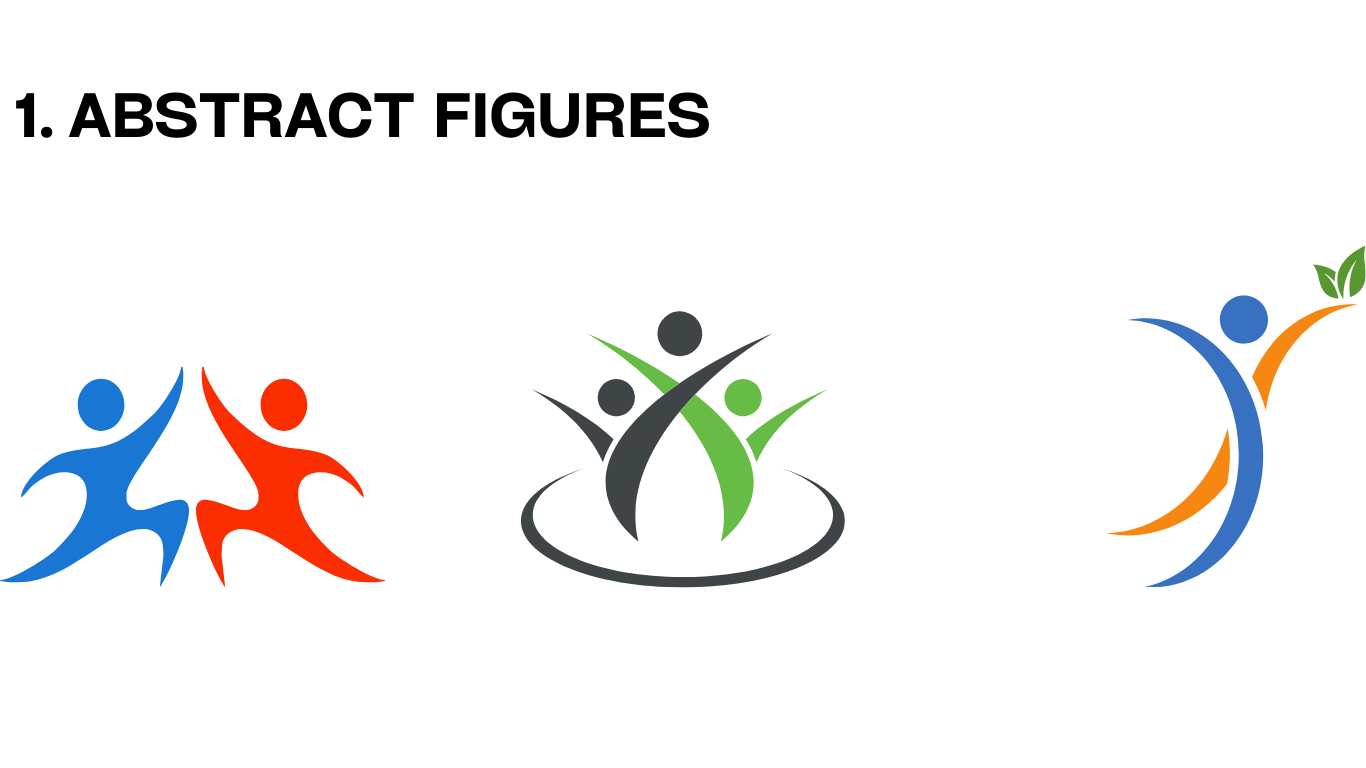
1. Generic Logos
A generic logo is considered a bad logo design because it looks like a lot of other logos. It’s not unique, memorable, or interesting—and it won’t help your business stand out from the crowd.
The idea most people have about Generic logos is that 'they’re a quick and easy way to get something up on the web'. But if your logo isn’t unique and memorable, it won’t do you any good.
In fact, a generic logo can actually work against you: You may not be able to protect it from misuse by others because there are so many other companies using similar logos that no one can tell who owns what.
Popular Examples of Generic Logos
Solution to Generic Logos
There are many ways to avoid creating a generic logo. Here are three tips for doing so:
1. The first is to spend a lot of time and money developing a truly unique logo.
This can be costly, but it can also be rewarding; after all, you’ll own the rights to your logo when you finish it—and no one else will be able to use it.
2. Avoid using stock images, clip-art or purchased vectors in a logo design.
If you do include stock images, clip-art or purchased vectors in a logo design, illustration design or icon design contest, make sure they’re modified and personalised so that they’re not recognizable as being generic.
3. Make sure the design stands out from other logos in the same field.
If you’re designing a logo for an animal hospital, do your research and make sure it doesn’t look like any other animal hospital logo out there—and if you are going to use a similar design, make sure it looks completely different from all of them!
Creating a Logo is time-consuming and requires research, expertise, and creativity. It’s best to hire an expert Creative agency that can work on your behalf.
2. Outdated Logo
A common example of a Bad Logo design is an Outdated one. A logo should be designed with the current trend in mind. It should not have an old-fashioned look and feel, nor should it look outdated.
If your logo looks dated, then people will associate your brand with being a bad logo design—and that’s not something you want!
A logo needs to be modern and relevant to appeal to today’s audience.
Popular Examples of Outdated Logos
The logos above look like they’ve been around for centuries—and not in a good way. Back in the day, overuse of effects like old-fashioned skeuomorphism (3D gradients), clip art, etc.
These effects make them look outdated and out of touch with the current trends. Logos should be designed for the current times and will look outdated if they’re not.
Solution to Outdated Logos
If your logo looks outdated, then you need a Logo redesign. You can update your logo in a few different ways:
-You can hire a designer to create a new one for you. Make sure that your new logo is fresh and up-to-date with today’s trends—that way, people will associate your brand with being modern and relevant!
-Remove the effects that make it look dated (e.g., drop shadows, gradients) and keep only what’s necessary (e.g., font choice).
-Update the colors so they fit into current trends.
Note: Retro design shouldn't be considered "outdated" if it's done well. If your logo is retro, but it looks outdated and you want to update it without losing the design style of your company, then it is best to hire a Creative Agency to work with you.
They can help you redesign the logo so that it still looks like it belongs in the same decade as your brand, but also updated for today's trends and design standards.
3. Confusing Logos
A good logo design should be memorable and clear. If people can't understand what your company does after seeing your logo, then it's not doing its job.
There are many ways that a logo could be confusing:
-Too many elements (e.g., text and icons) that don't work together well.
-Too many colors.
Logos that are graphically pleasing but don’t clearly convey a brand’s purpose or values may still fail to effectively communicate their message.
It is a common problem in any endeavor: what the creator imagines is not always understood by their audience.

The first Logo (green) doesn't clearly communicate what the company does: it might be a real estate or construction company, but we cannot tell from the image alone.
Also, the slogan—"We Deliver the Best Services"—is vague and confusing because it raises more questions than answers.
Solution to Confusing Logos
-Focus on clarity, not cleverness.
-Keep it simple.
-Use words that are easy to understand and memorable.
-Make sure your logo conveys what you do and how you do it.
4. Too Detailed Logos
Detailed Logos aren't bad—the issue is they aren't scalable. They can be problematic if the design is too intricate and detailed, making it hard to reproduce at small sizes.
Logos that are too detailed can be difficult to read when they're small, and they don't look good on a variety of backgrounds. They also take up more space than necessary, which makes them harder to incorporate into your website design.
If you plan to use your Logo only on large surfaces, such as billboards or signs, then you should definitely consider a detailed Logo.
However, if you plan to use your logo in many different places and in many different sizes (such as on business cards or websites), then it's best to keep things simple.
The solution to Detailed Logos

Heineken uses the same logo on its website and business cards. However, it has created a separate version of the logo for use in small sizes.
If you are reluctant to change your detailed Logo, that's okay. A solution is to make your logo responsive or make other alternatives (in small sizes) to your Detailed Logo.
If you are using your logo on a website, then you can use a different logo in small sizes. If you are using your logo on business cards or other medium-sized surfaces, then it's best to create a separate version of your Logo for these purposes.
5. Logos with Conflicting themes
Logos with conflicting themes are often confusing and difficult to interpret.
Conflicting themes can mean different things to different people, which is why it is important to keep your logo simple and clear in its message.
For example, If you have a logo that is fun, playful, and youthful, but then you use it on business cards for an older audience or in a serious environment, then the two themes will clash.
6.Vague Logos
A vague logo is somehow similar to a Conflicting themes Logo. It is considered as a bad logo design because it is not easily understood by the viewer.
It is easy to create a vague logo, and it usually comes down to a lack of detail or clear definition.

When you look at a logo and cannot tell exactly what it represents or what message it conveys, then there is probably something wrong with it.
Your logo might look good but if it doesn’t say anything about your brand, it’s still a bad logo design.
Solution to Vague Logos
The best way to avoid creating a vague logo is by being as specific as possible. Make sure that your logo has clear and concise messaging so that viewers know exactly what it’s trying to convey.
For example, if you are designing a logo for a Non-profit organization, then make sure that all of the elements in the design reflect this message like the one below.
7. Logos with Irrelevant Imagery
In many cases, the cause of a bad logo design is that it has irrelevant imagery. This can be anything from using an image of a car when you’re designing for an accounting firm, to using images that don’t match your brand.
For example, the Logo below uses irrelevant imagery that doesn’t match the Fast Food Brand.

Solution to Logos with Irrelevant Imagery
The solution to logos with irrelevant imagery is pretty simple: get rid of the irrelevant imagery. This doesn’t mean that you have to completely rebrand your company; instead, just remove any elements that don’t make sense for your particular industry or business model.

8. Poorly Executed Logo Design or Simply, really bad logo design
There are many reasons why a logo might be poorly designed.
One of the most common is that it simply looks amateurish and doesn’t have any real substance to it.
This can happen when you’re designing for yourself or working with an in-house designer who isn’t very good at their job.
If you’re designing your own logo, make sure that you have a solid grasp of the fundamentals of design before starting.
Once you have some experience under your belt, then feel free to experiment with more advanced concepts.
But if you don't, you may want to hire a professional designer to help.
Solution to Poorly Executed Logo Design
There's no easy fix when it comes to bad logo design: the only way to create a good one is by understanding graphic design principles.
If you want to learn graphic design yourself, this article on “How to design a logo” can help.
But if you want your logo to have an effective design, it's best to hire a Creative Agency that knows the principles inside and out.
Final Words
The purpose of a logo is to communicate what your business is all about.
It should be simple, memorable and convey the right message to your target audience. The best logos use simple shapes, colours, fonts and images that everyone can understand.
Don’t try to do too much with your logo; if you want people to remember it easily, keep it simple!
Want a unique logo design for your brand?
Work with our talented designers to make it happen.
